From the moment I first heard Passion Pit’s “The Reeling," I was hooked. “Manners” became my album of the summer and ironically, I learned it was the 15th anniversary of its release. I redesigned the cover to reflect how I feel when listening.
“MANNERS” REDESIGN
BRIEF
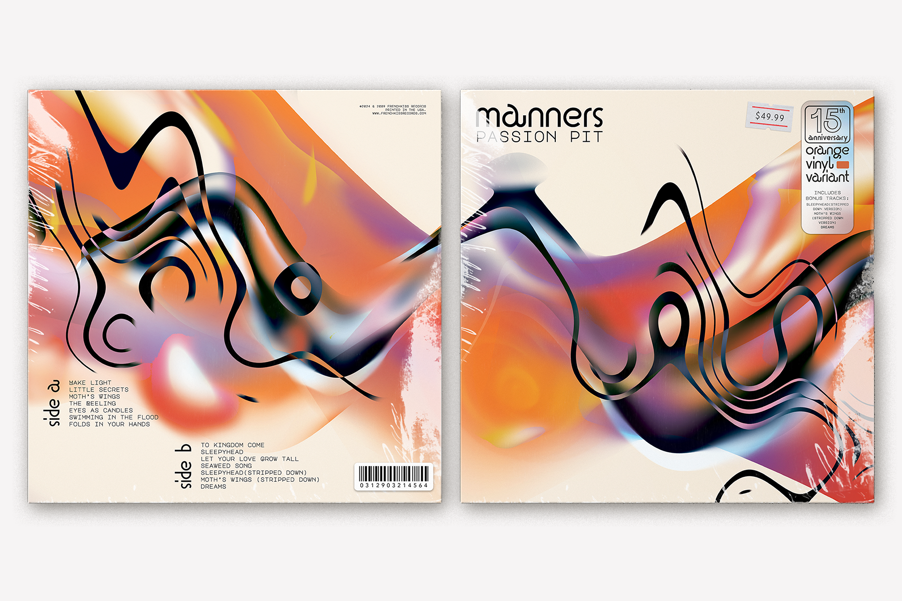
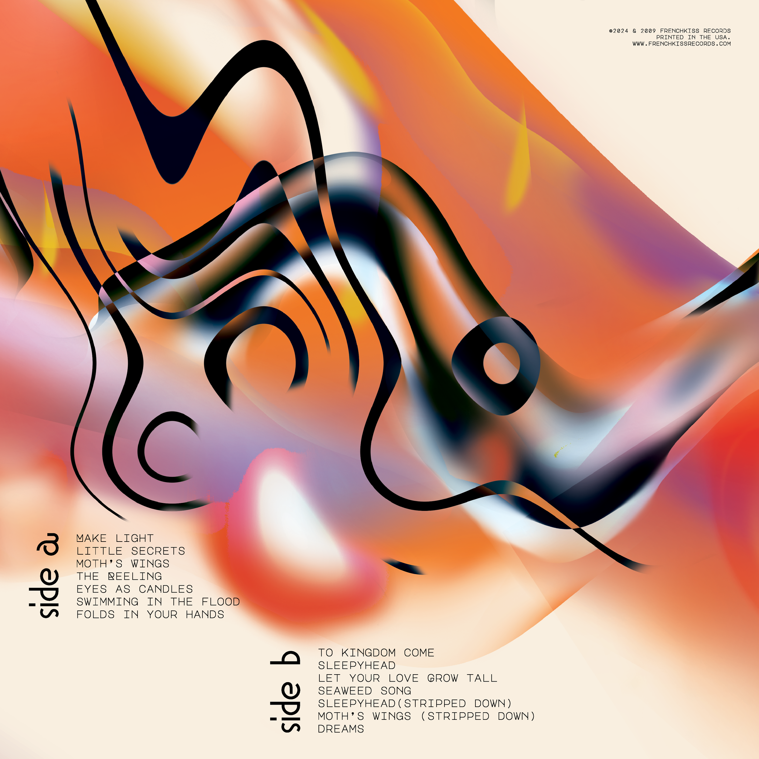
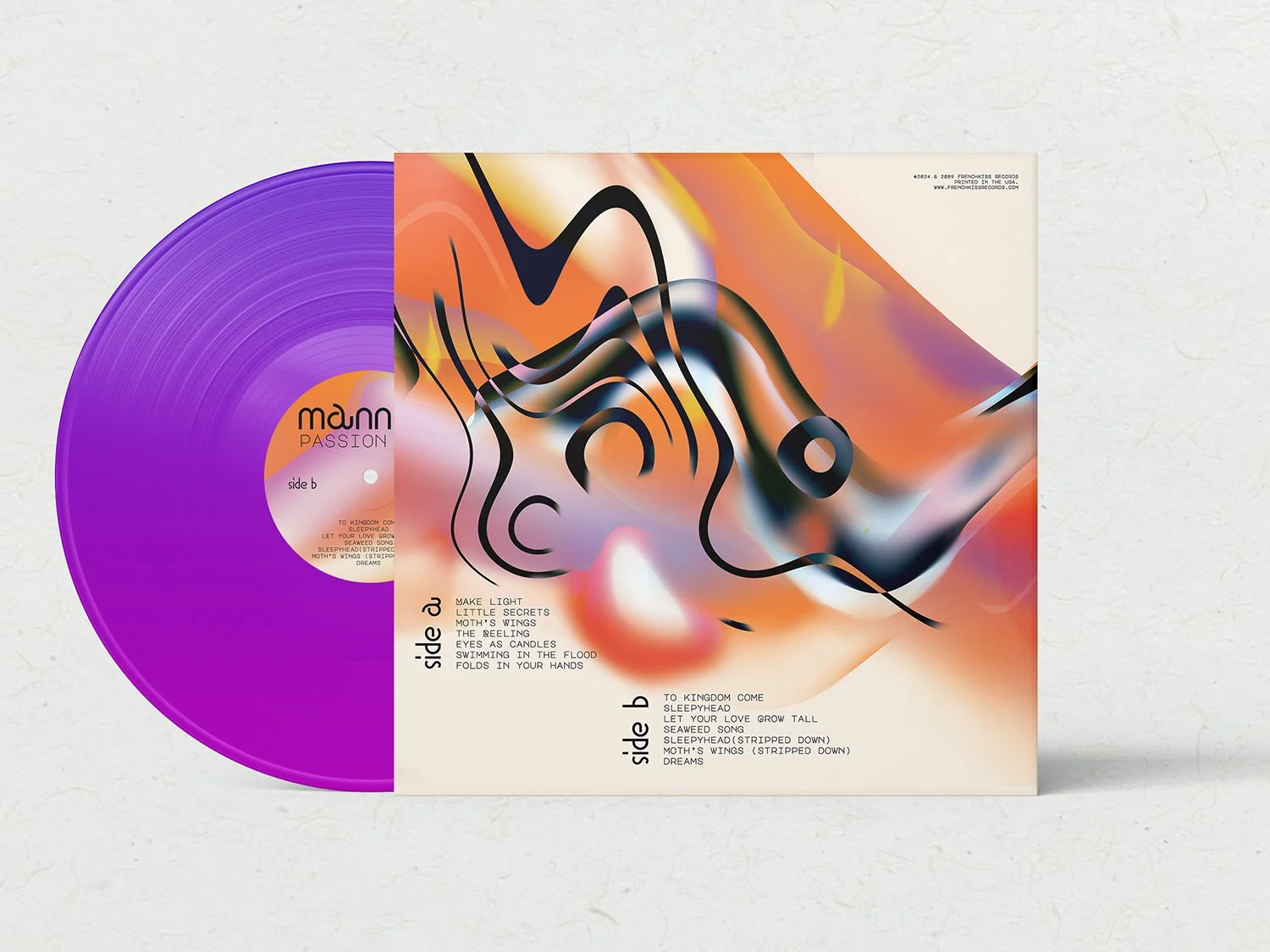
Redesign the front & back album covers, labels, & records of “Manners” by Passion Pit.
SOLUTION
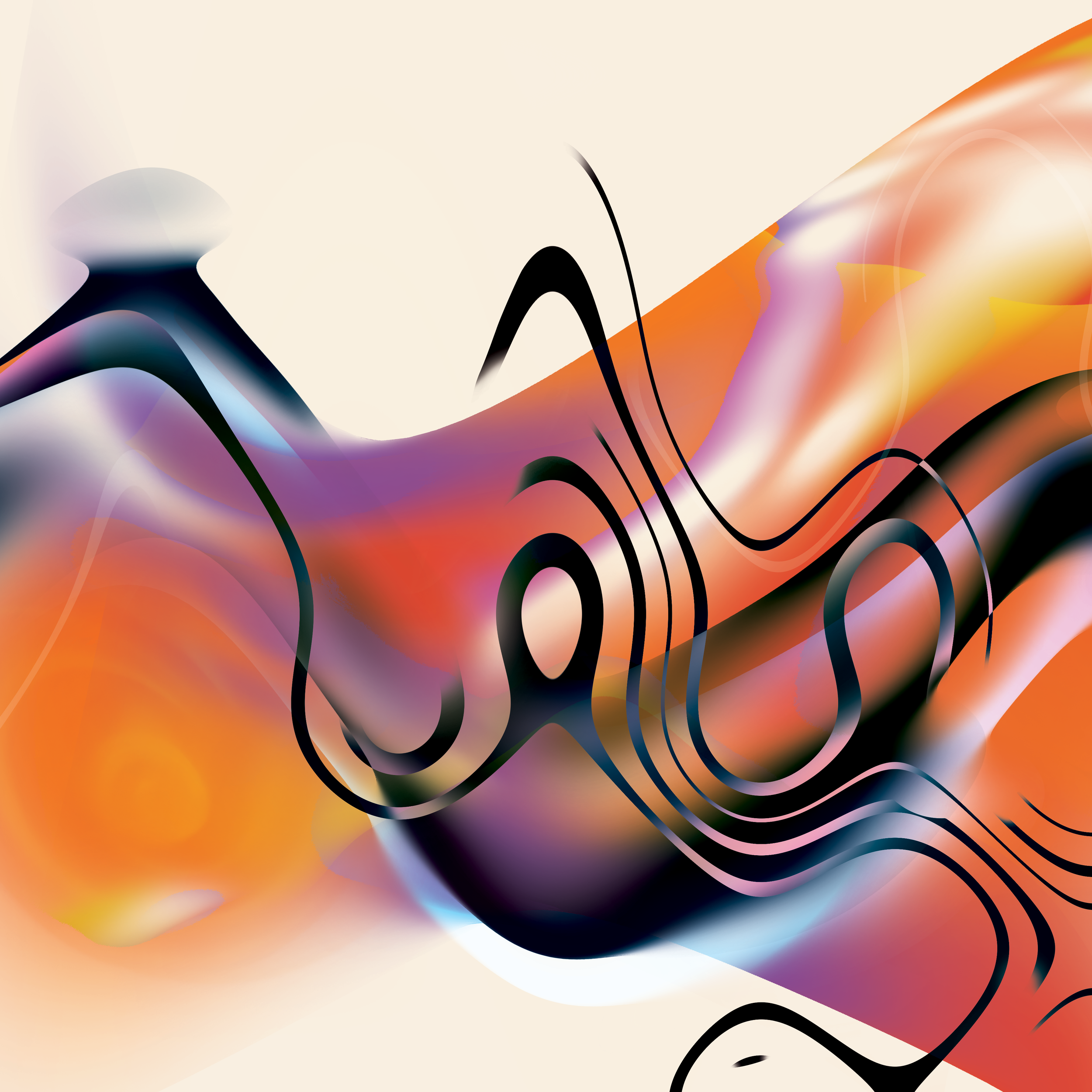
My goal was to translate how I feel while listening to this album into a visual medium.
Inspired by Robert Seidel’s Deluxe Edition album cover, I maintained the orange & purple tones, wavy lines & flowing visuals. I layered an extreme amount of line & colour while experimenting with blend modes until I was satisfied with the visuals. The chaotic imagery, overlapping lines & blending waves of colour represent the layered elements of the music.
This design seamlessly connects from the front into the back cover to create one large image. This symbolizes the flowing nature & cohesiveness of the album.