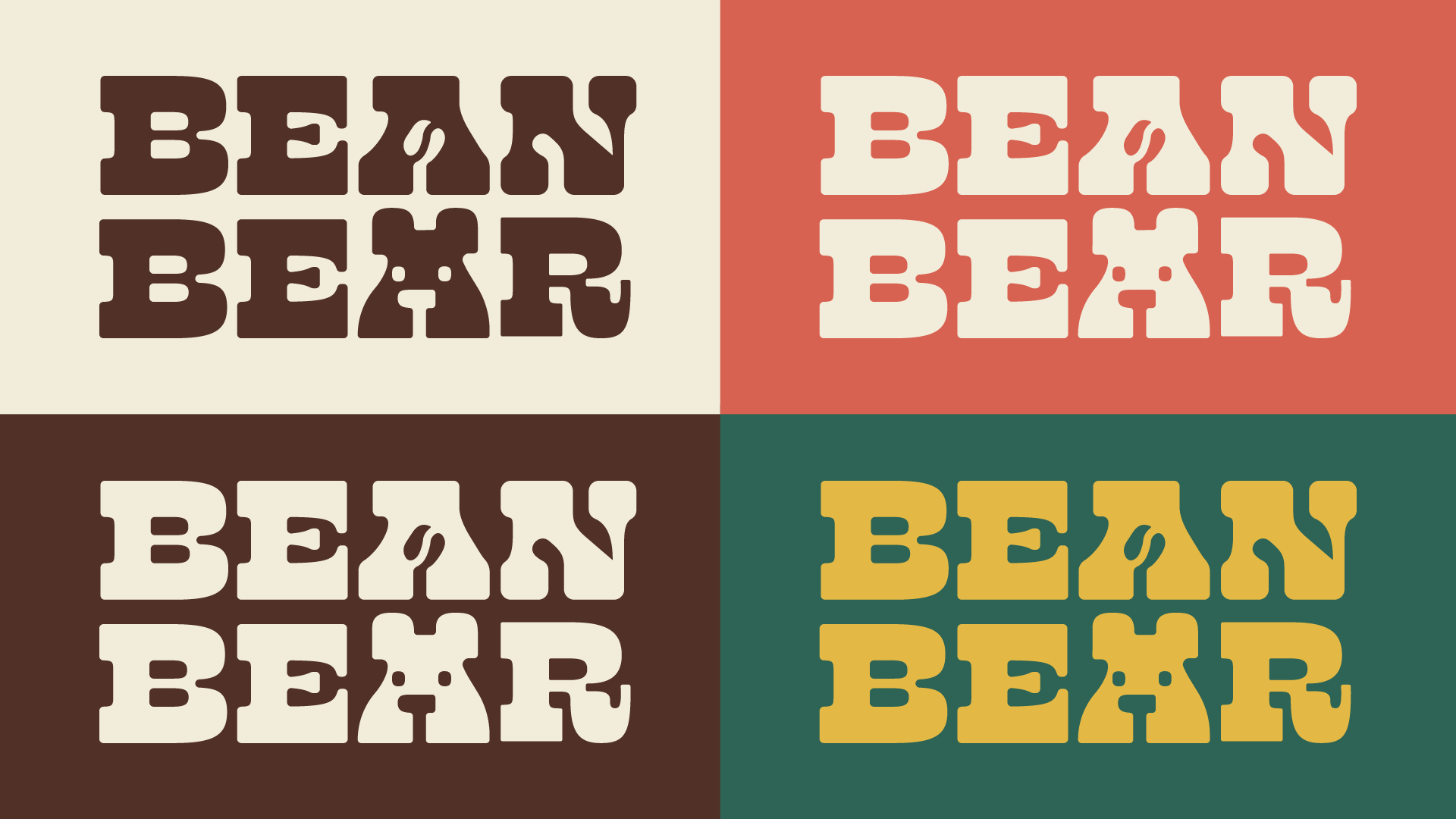
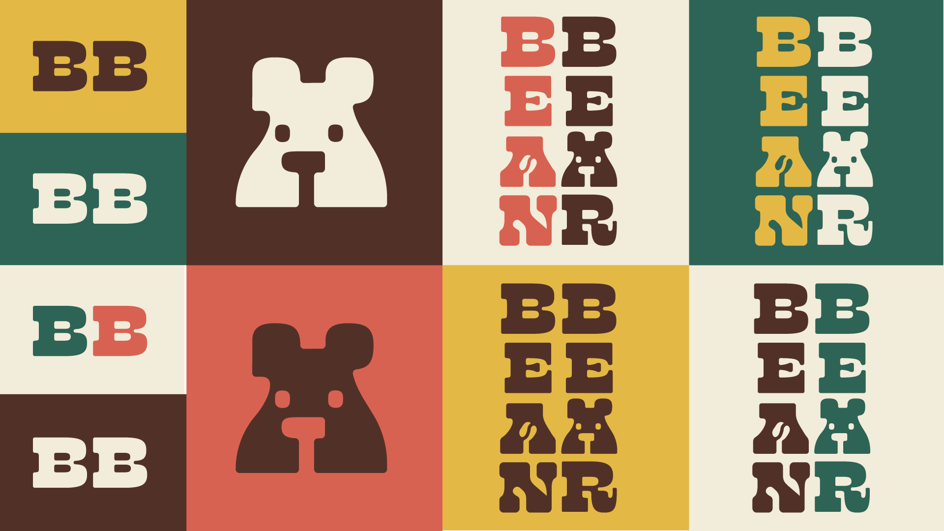
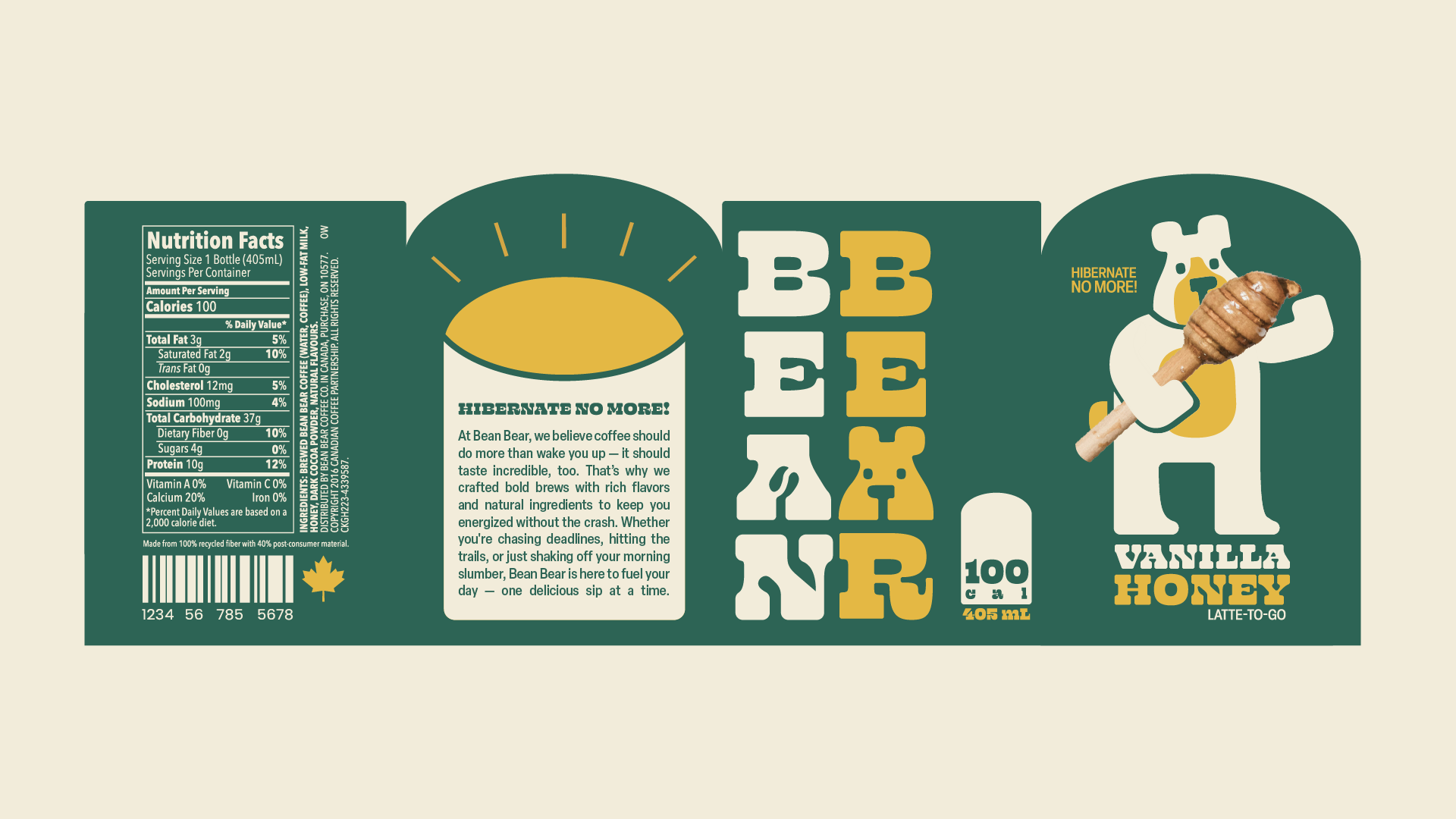
Rounded edges are used throughout the design, including the logo type, mascot illustrations, and label shape to create a homely look.
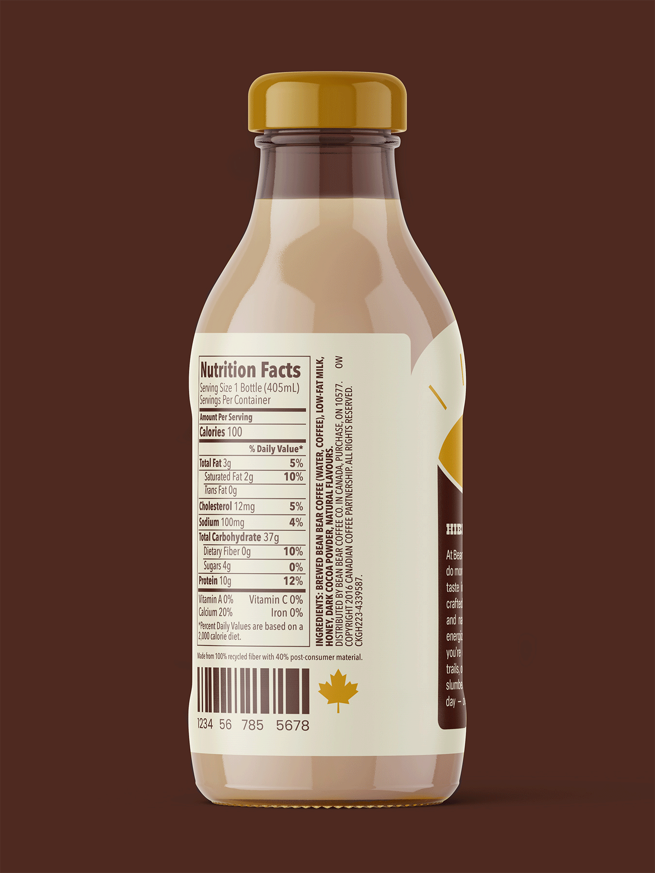
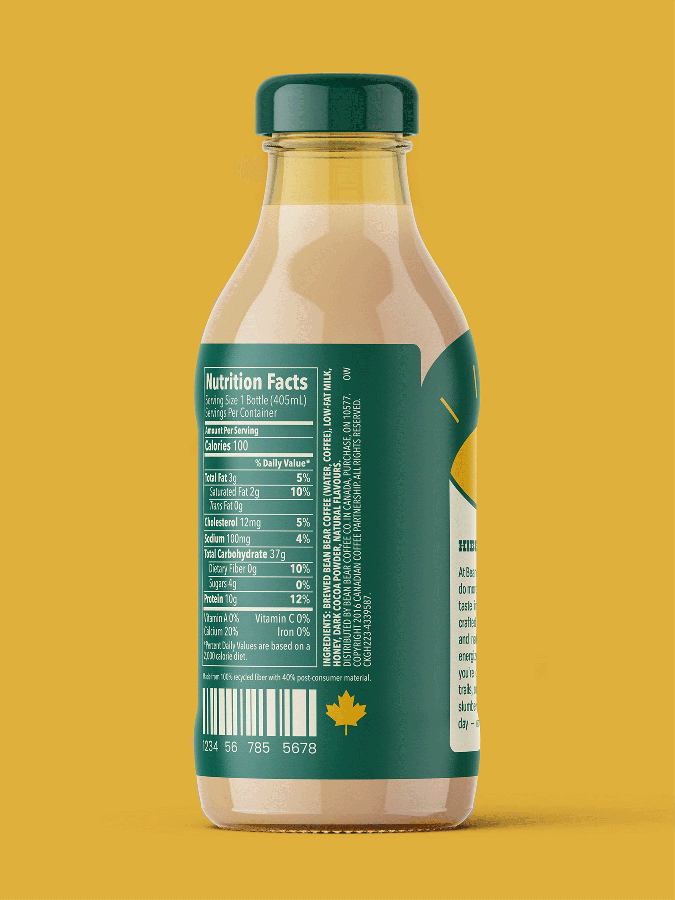
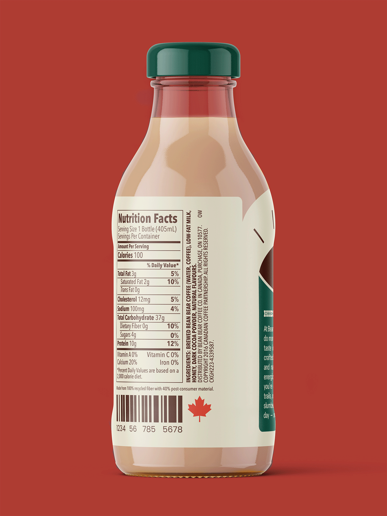
A friendly bear mascot was implemented in both the logo and label design. This creates a cute, recognizable character for consumers to connect with. Real images contrast against the illustrations to highlight the natural ingredients of the product & make their flavours quickly understood at a glance.
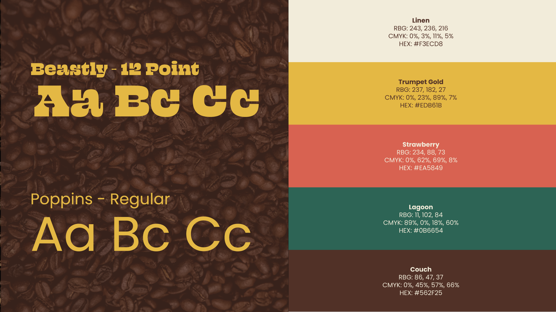
A nature-inspired colour palette containing warm, less saturated shades were chosen to stand out against competitors in this space while maintaining its approachable spirit.