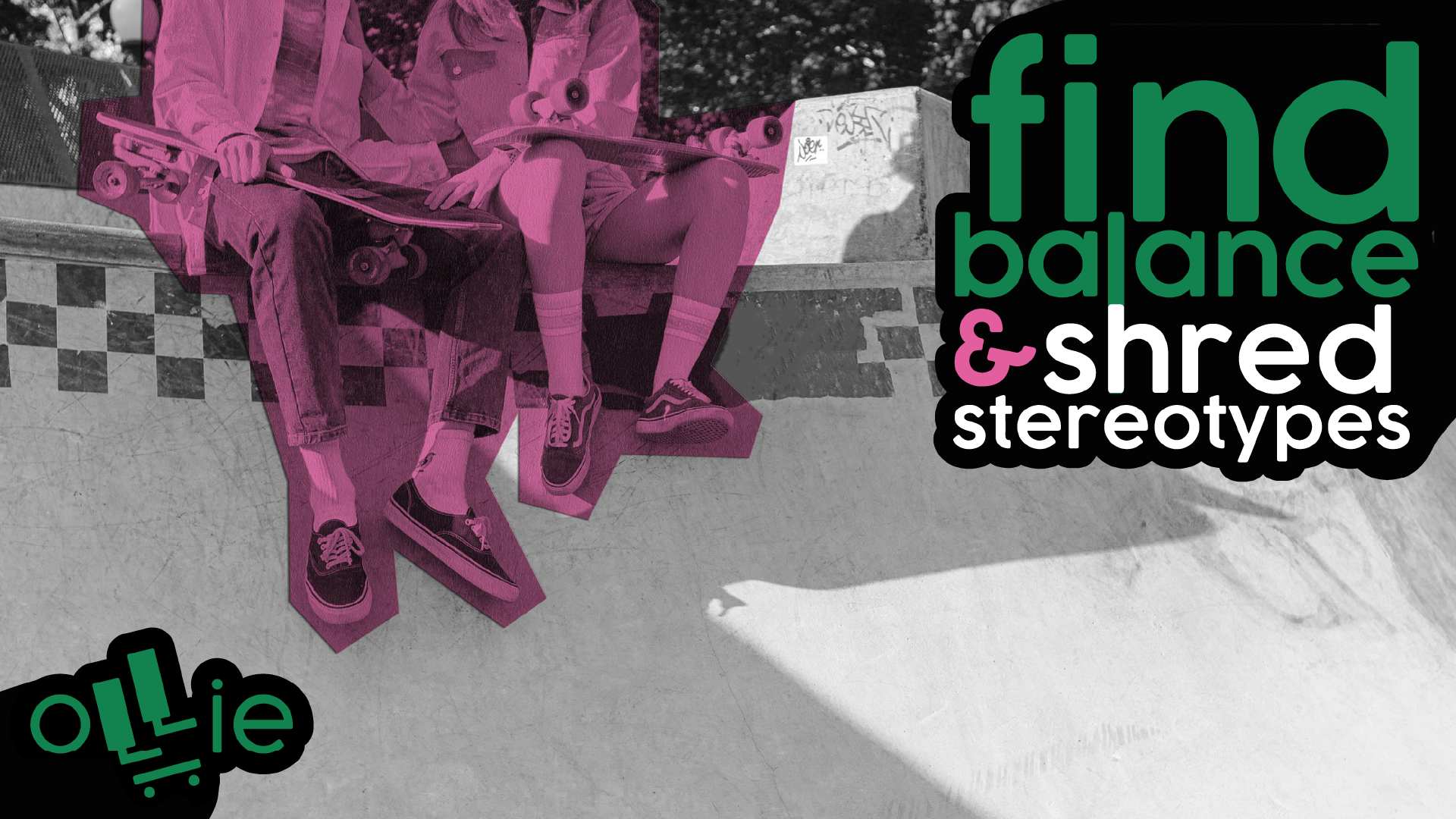
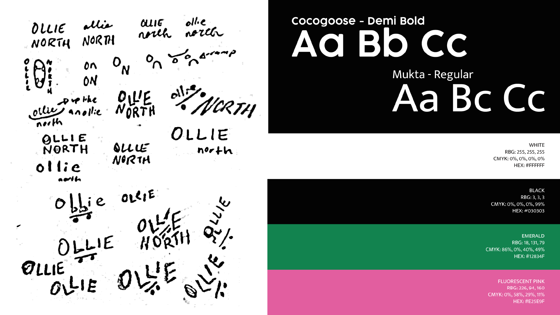
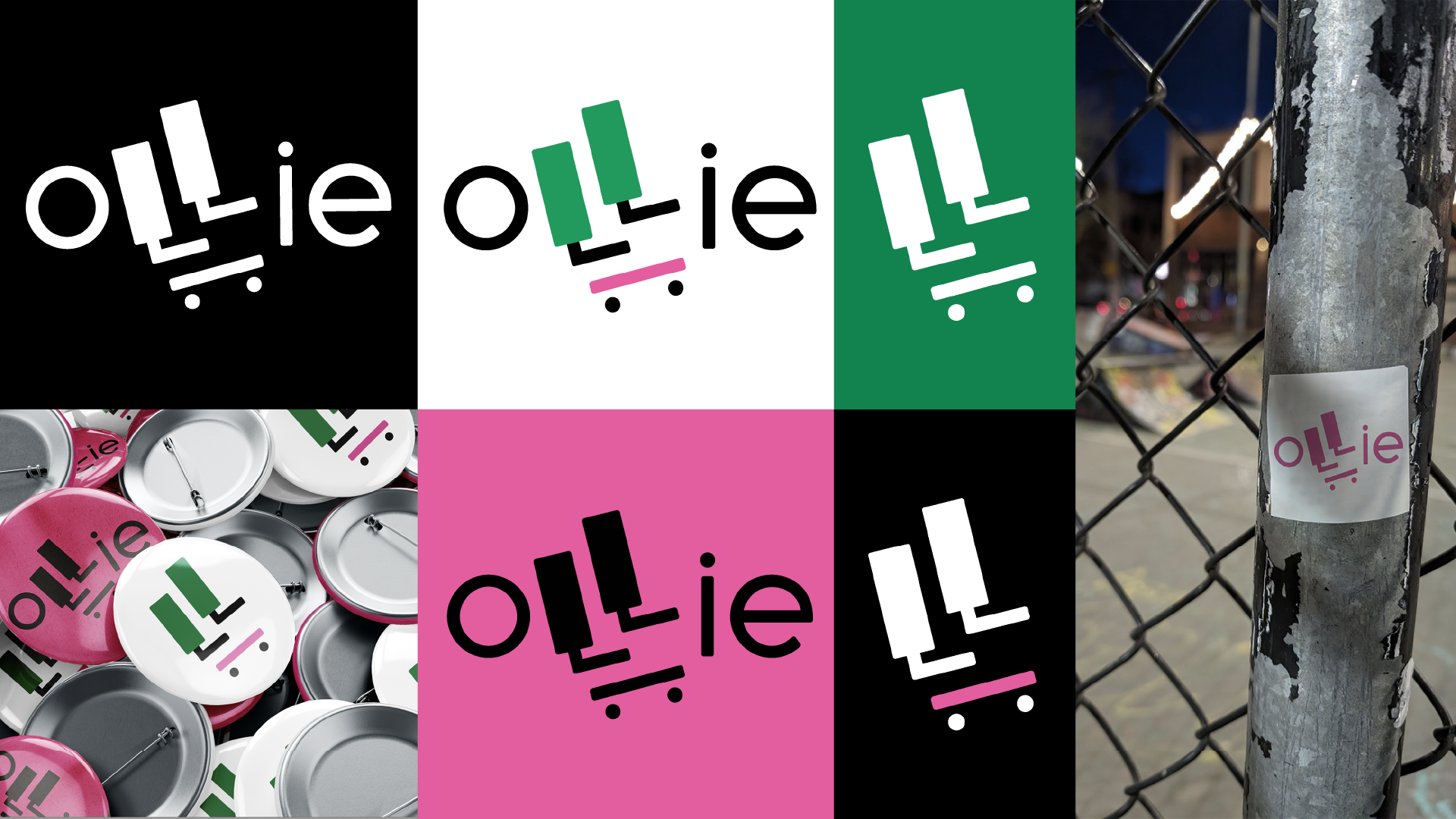
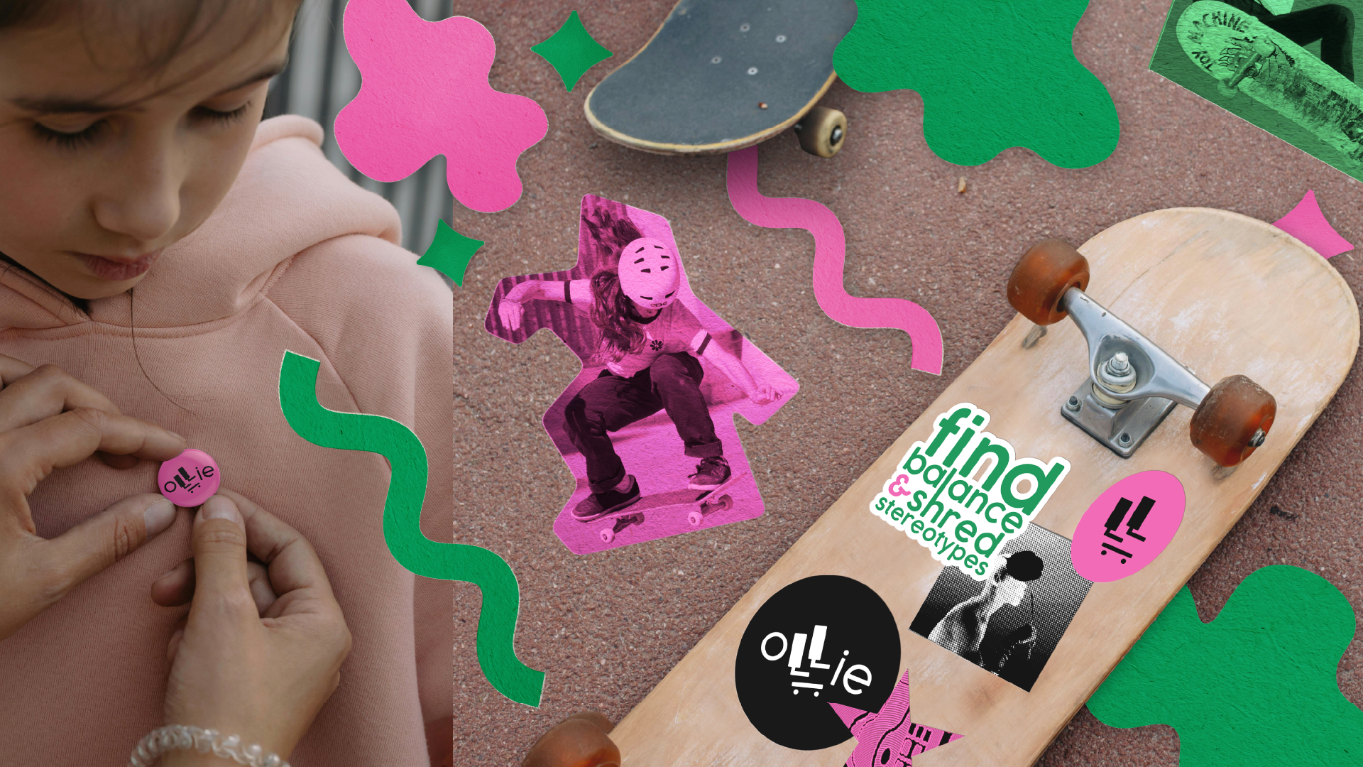
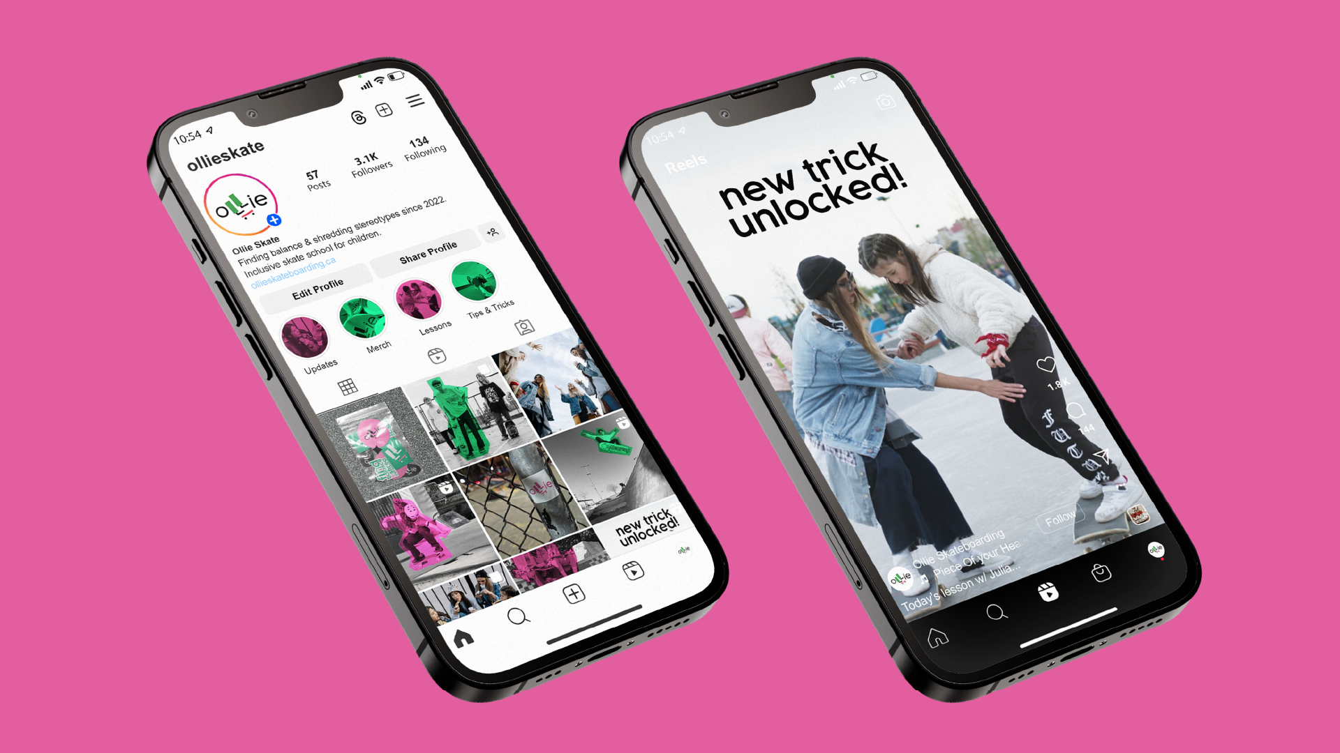
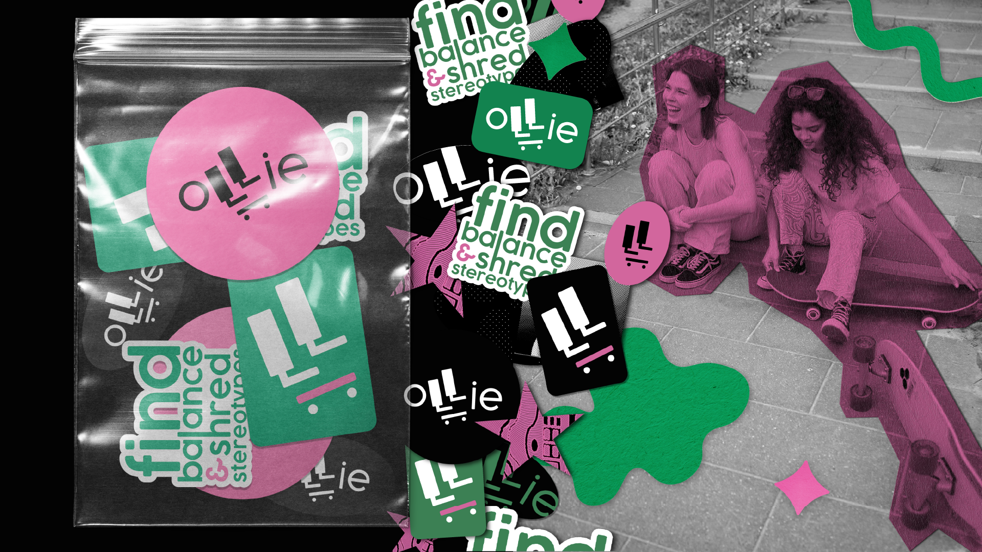
To create the bold & edgy look Ollie was looking for, a high contrast colour palette of black & white with pops of colour was decided on. Pink represents femininity while emphasizing fun & playfulness. Green symbolizes growth & youth, two main focuses of the company.
Black and white photography is primarily used by this brand, with colour to create focal points in the photos. These coloured areas appear as paper cut outs, giving the illusion of collage work or scrapbooking. This idea showcases importance of community to Ollie, as its represents a diverse group of teachers & students joining together to form a bigger picture: creating a safe space in skateparks.