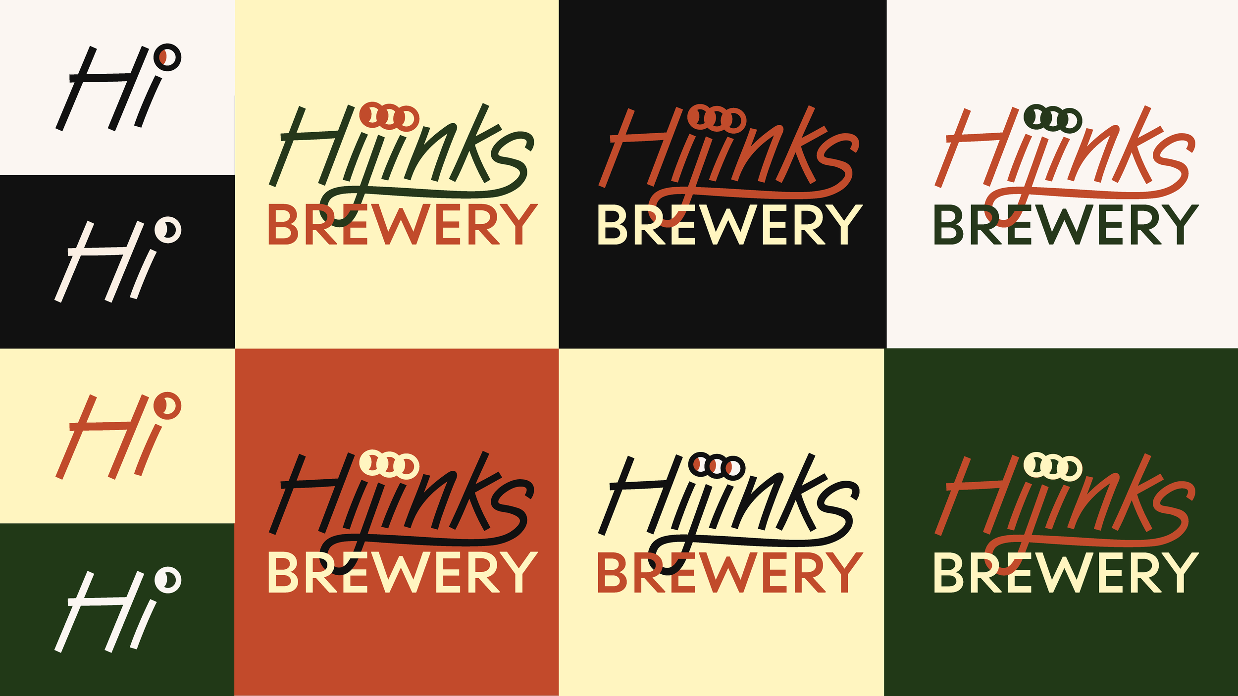
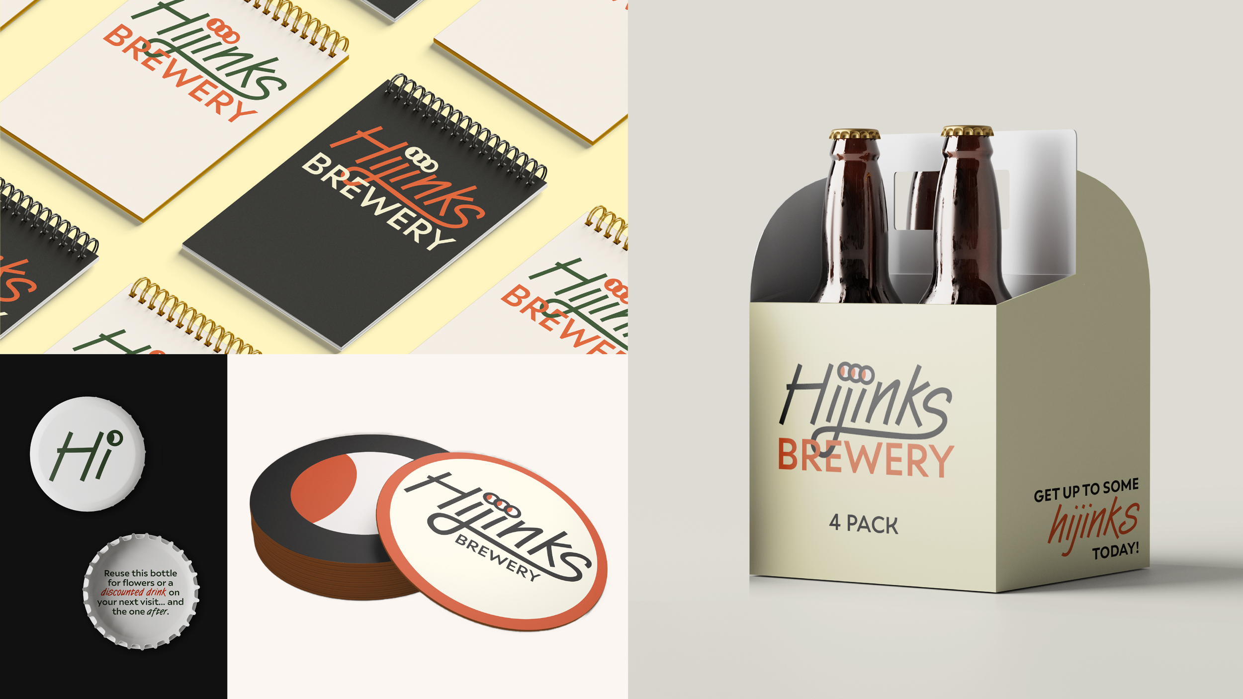
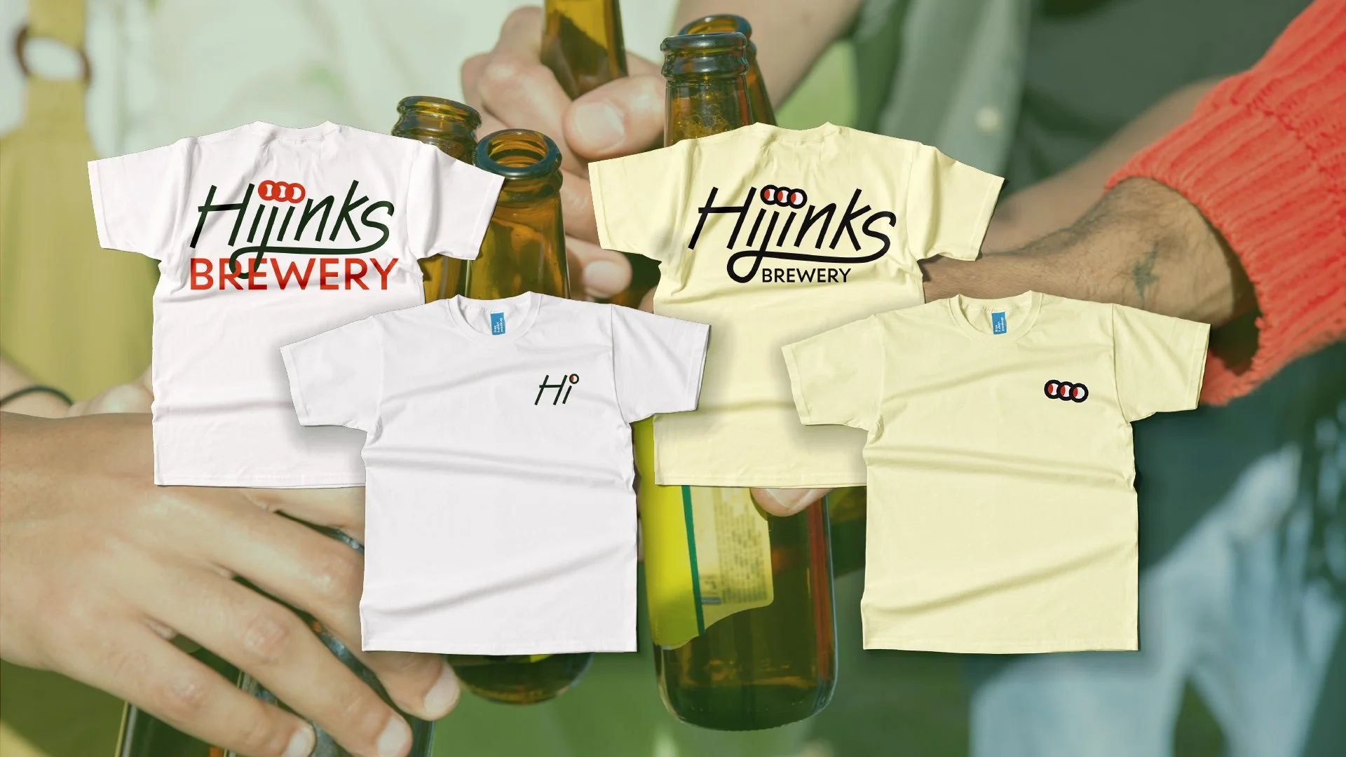
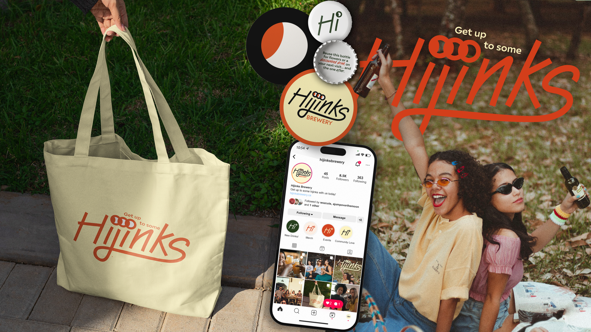
The definition of Hijinks is “noisy, energetic, cheerful fun”; the feeling this branding had to provide.
The dots on the “iji” in the “Hijinks” wordmark logo can appear as either eyes or Venn Diagrams. Eyes are usually expressive and used as a way to communicate. They keep the branding playful while emphasizing connection. A Venn Diagram showcases unique, individual characteristics and similarities that are overlapping.
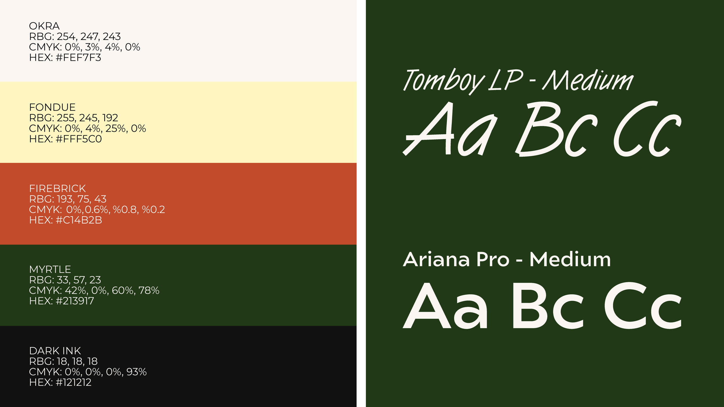
The handwritten typeface promotes a familiar demeanour with its organic shapes & casual look. This also emphasizes the hand-crafted nature of their products.
The colour palette contains warm tones to promote a sense of comfort & warmth while still conveying an excitement & energy through the combination of orange and yellow .