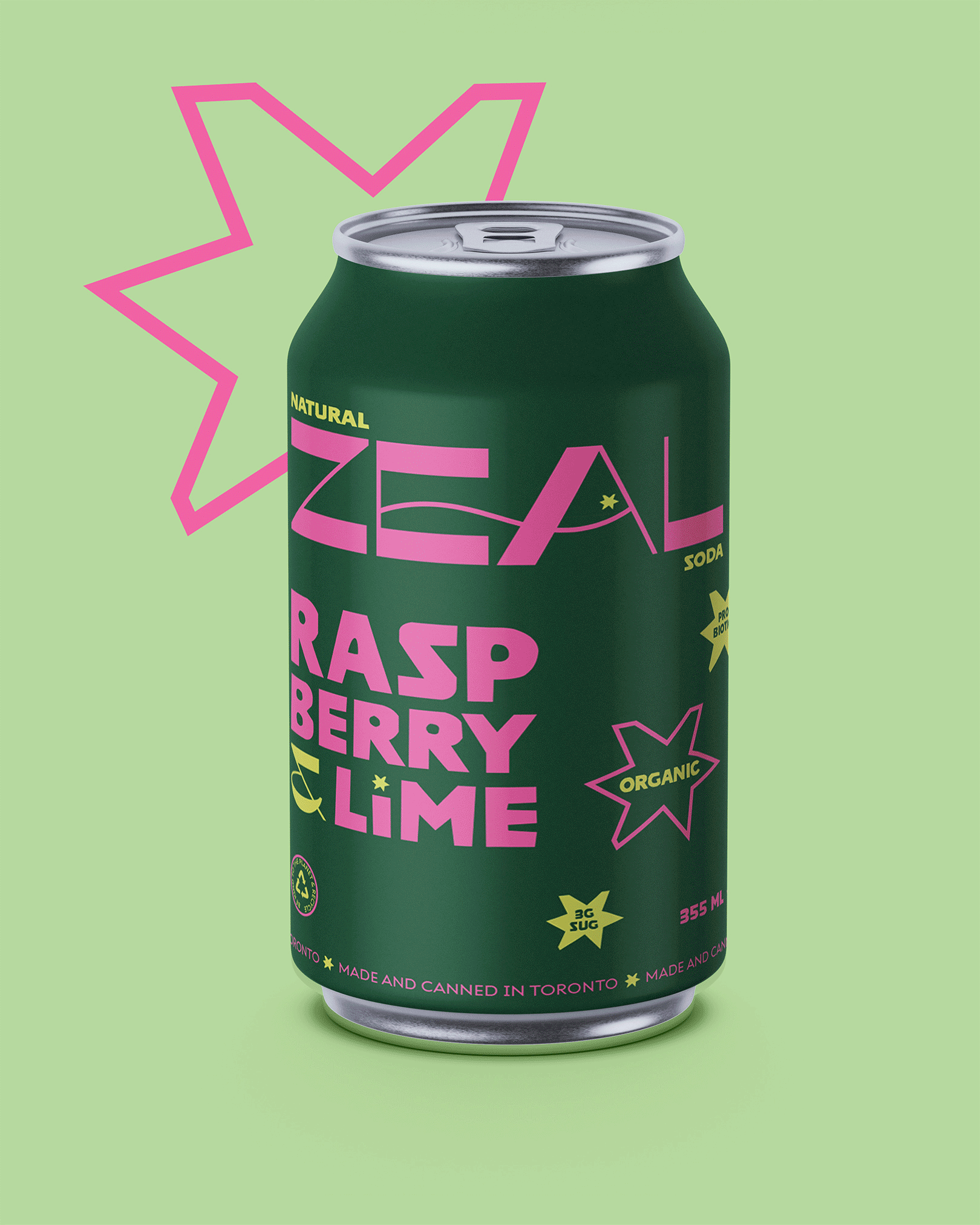
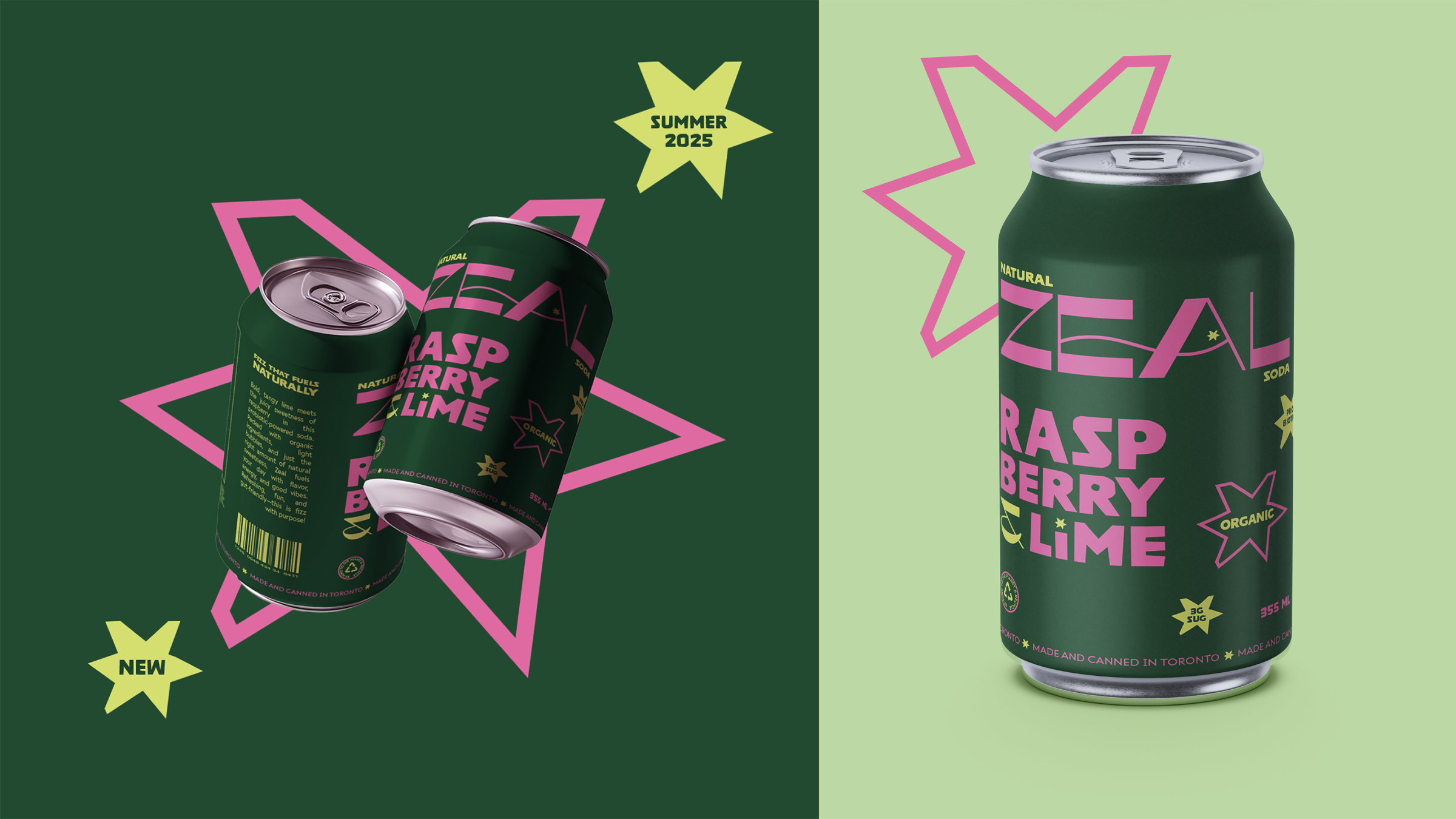
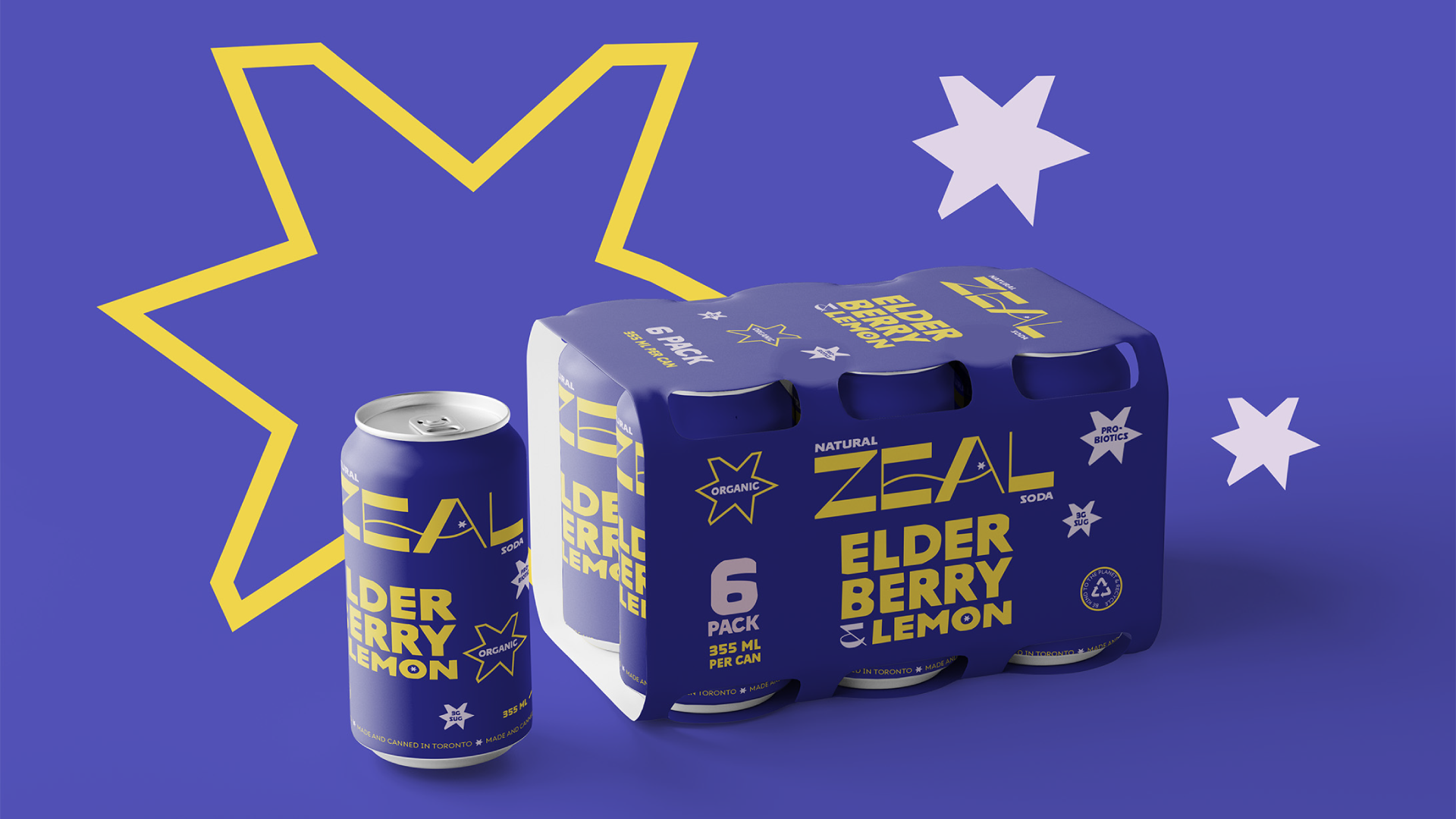
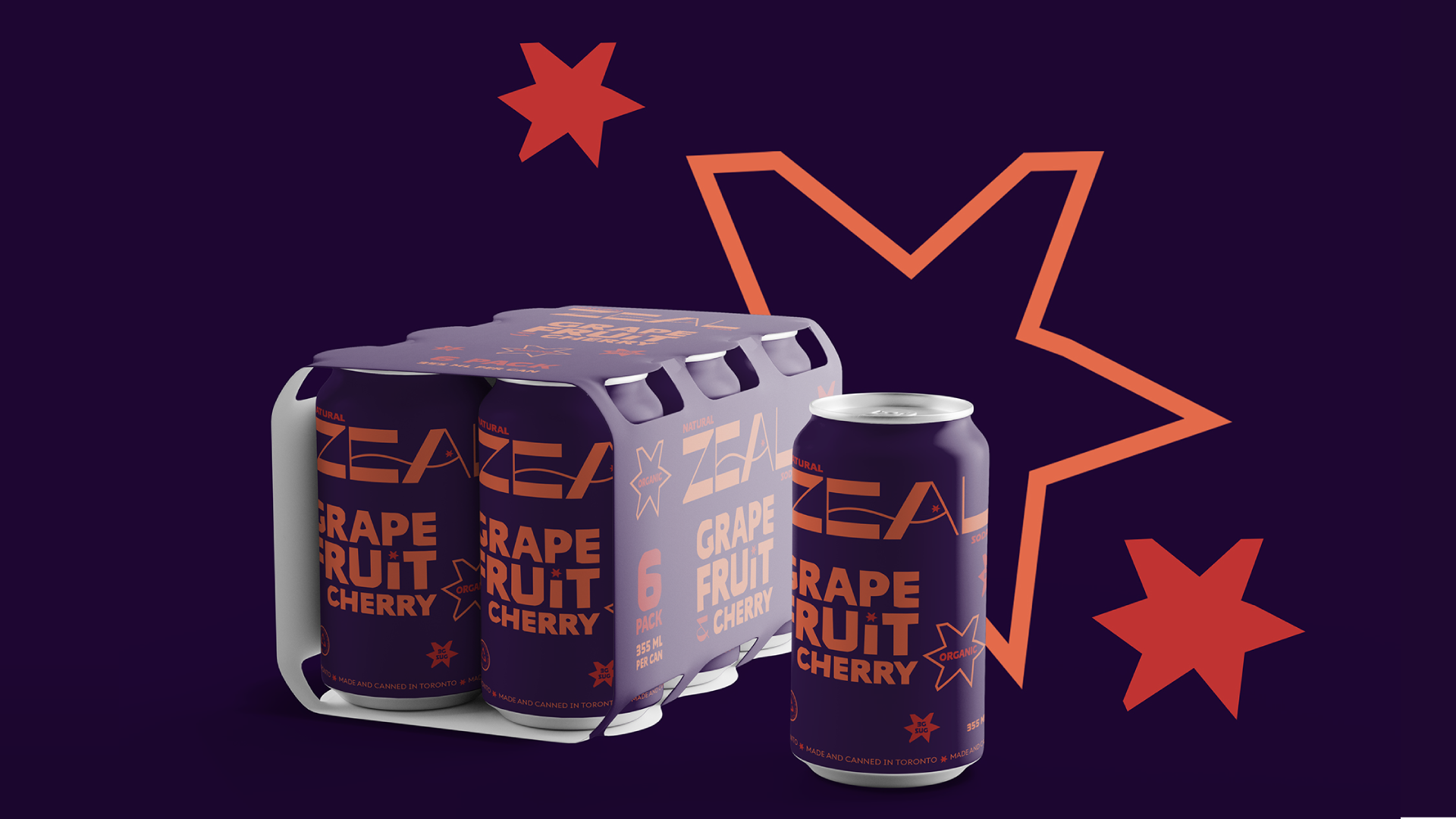
Zeal is a health-conscious soda brand that offers refreshing, naturally flavoured, probiotic-infused carbonated beverages.
ZEAL NATURAL SODA
TASKS
Logo Design, Branding, Packaging Design
Create branding for Zeal, along with packaging for cans and 6-pack cases.
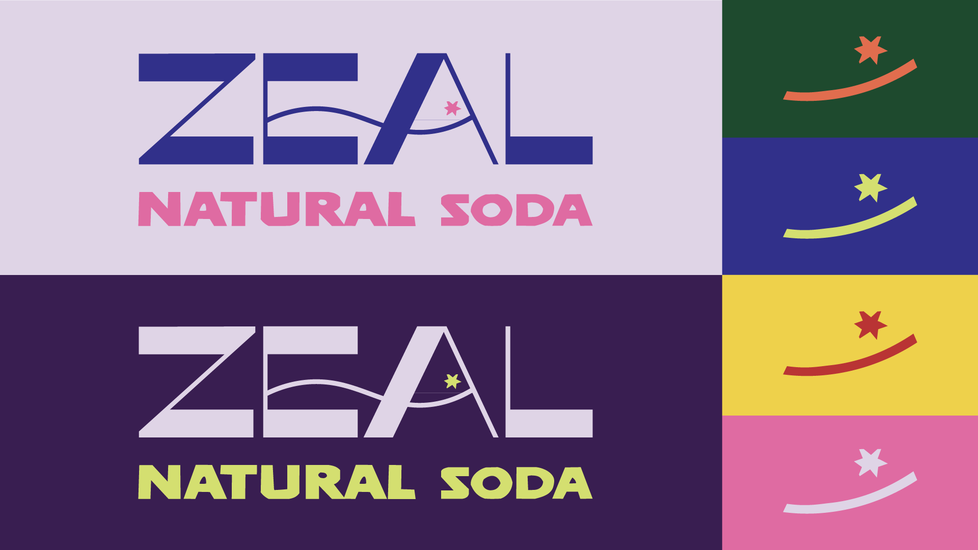
The logo features a smile with a star eye, symbolizing joy, energy, and a zest for life. The word mark has a wave connecting the “E” and the “A” to show it’s a beverage while using an organic curve to communicate its use of natural ingredients.
Using a bright colour palette emphasizes the energetic and fun aesthetic of the brand. The cooler tones highlight the refreshing nature of the soda, perfect for cooling off on a hot day.
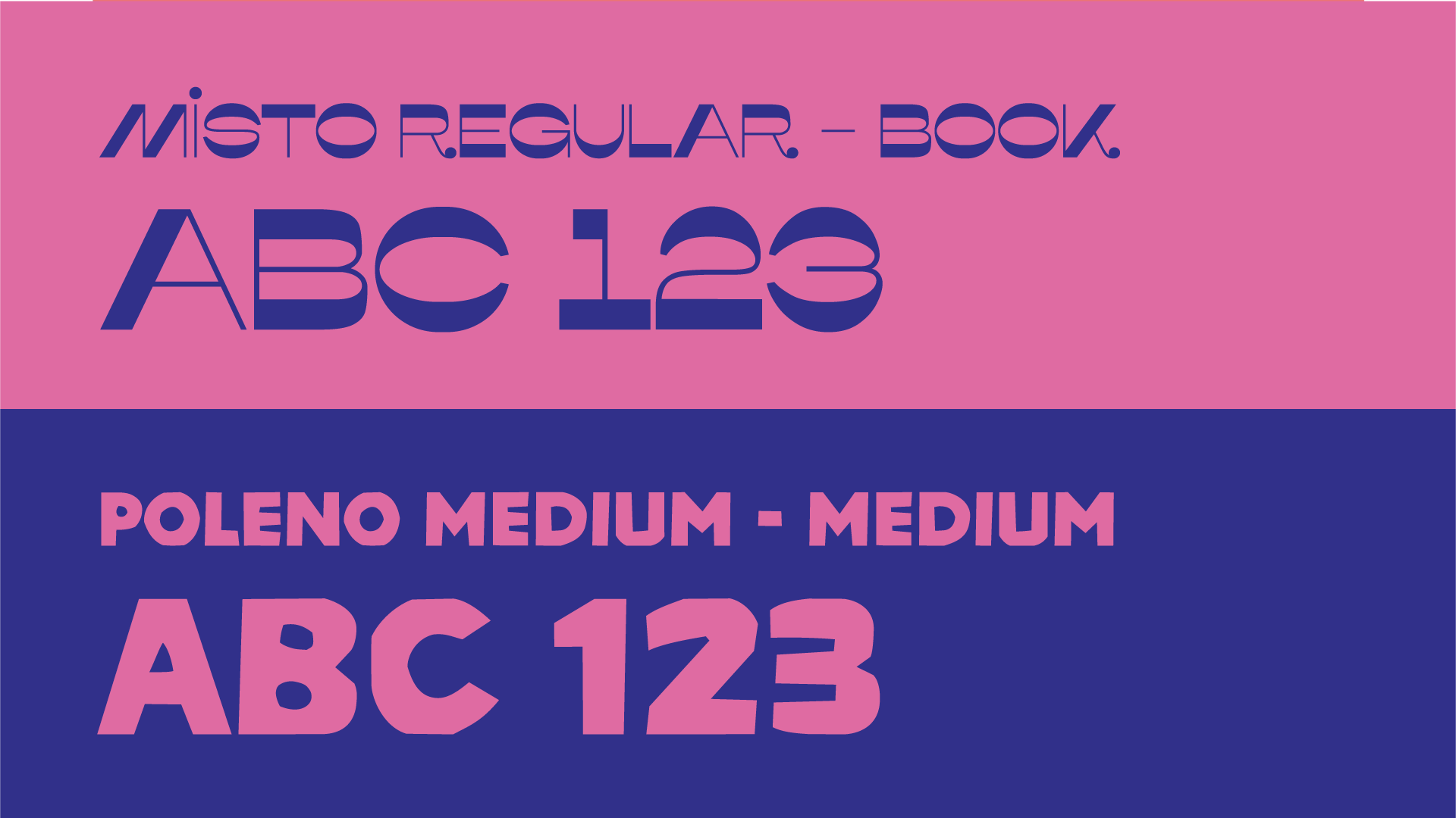
The primary font accentuates the funky look Zeal was looking for. The secondary font appears as organic, handmade shapes, communicating the idea of natural ingredients.
BRIEF
SOLUTIONS